home
work
about
HUDDLE
Redesigning text-heavy corporate training as a microlearning experience
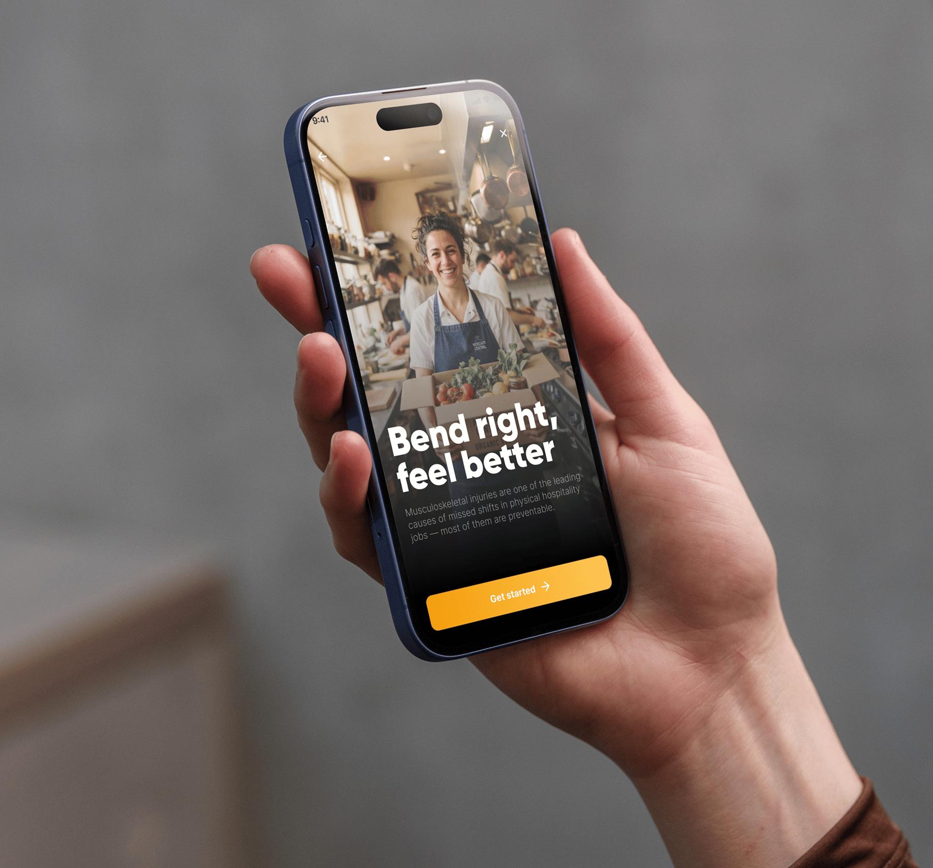
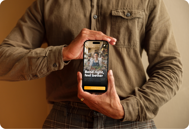
Most corporate training still looks like a PDF wearing an app: long screens of policy-style text, no pacing, no interaction, built to be assigned rather than actually used. I picked one real example, a workplace ergonomics module, and rebuilt it as a gamified microlearning experience to show what training could look like if it respected how people actually read it, on a phone, standing up, between shifts.
Type:
LMS Redesign

Tools:
Figma & Claude
Industry:
Hospitality
SUMMARY
Turning personal experience into a design opportunity
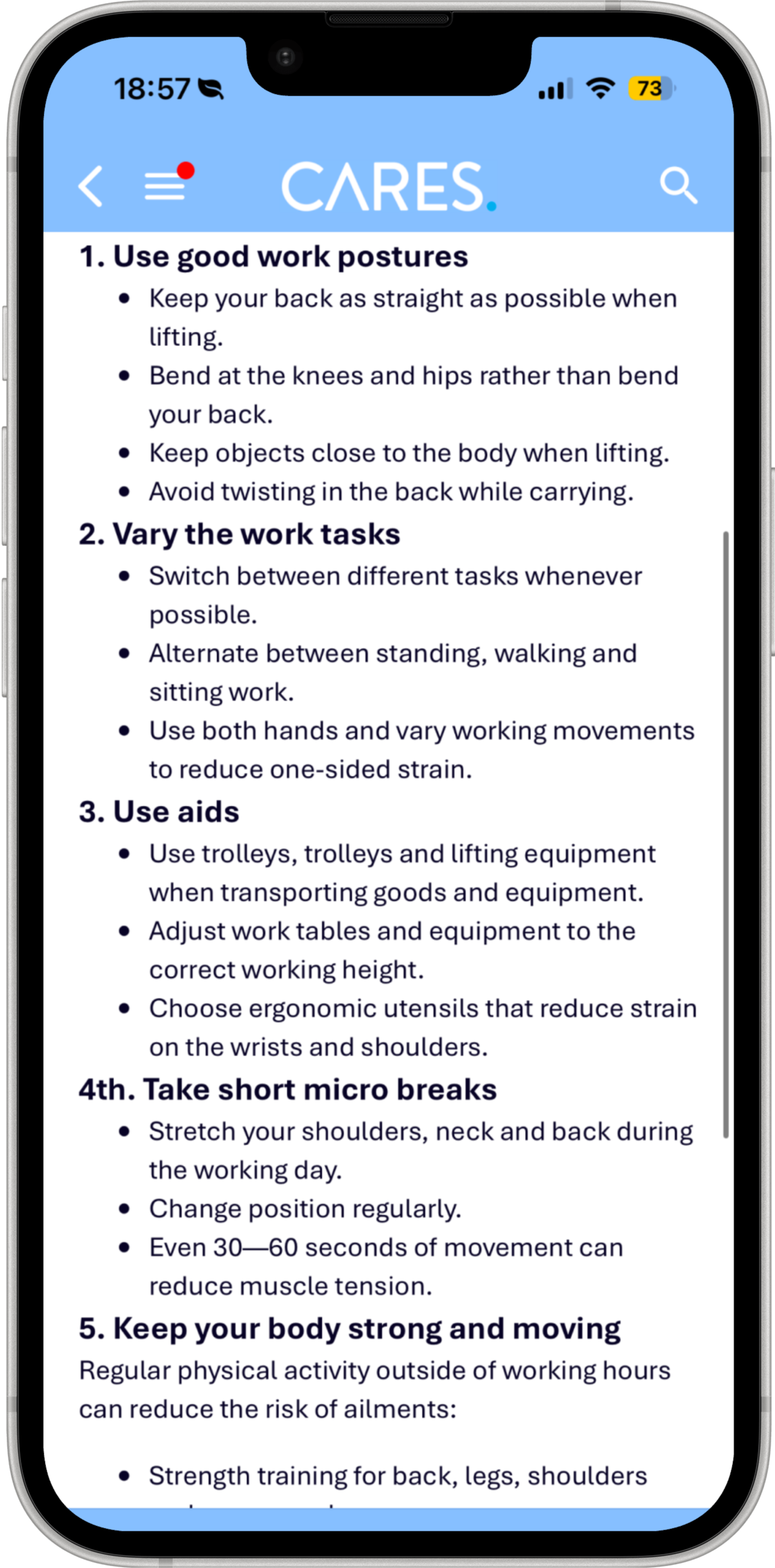
This project was inspired by my own experience as a hospitality employee using corporate training platforms. Corporate training often focuses on delivering information rather than creating effective learning experiences. I experienced first-hand how workplace ergonomics modules could become time-consuming, relying on long, static pages of text with little interaction or motivation to continue.
Research also showed that hospitality employees often have limited time available for training, which led me to explore how UX principles, microlearning, and gamification could transform the experience into a shorter, more engaging LMS solution adapted to their daily routines.

Problem: The existing LMS relied on lengthy, text-heavy modules that required significant time investment, creating cognitive overload and a passive learning experience that did not fit the reality of hospitality employees.

Solution: Redesigned the experience into a mobile-first, interactive LMS using microlearning and gamification to deliver shorter learning moments that are easier to complete, understand, and retain.
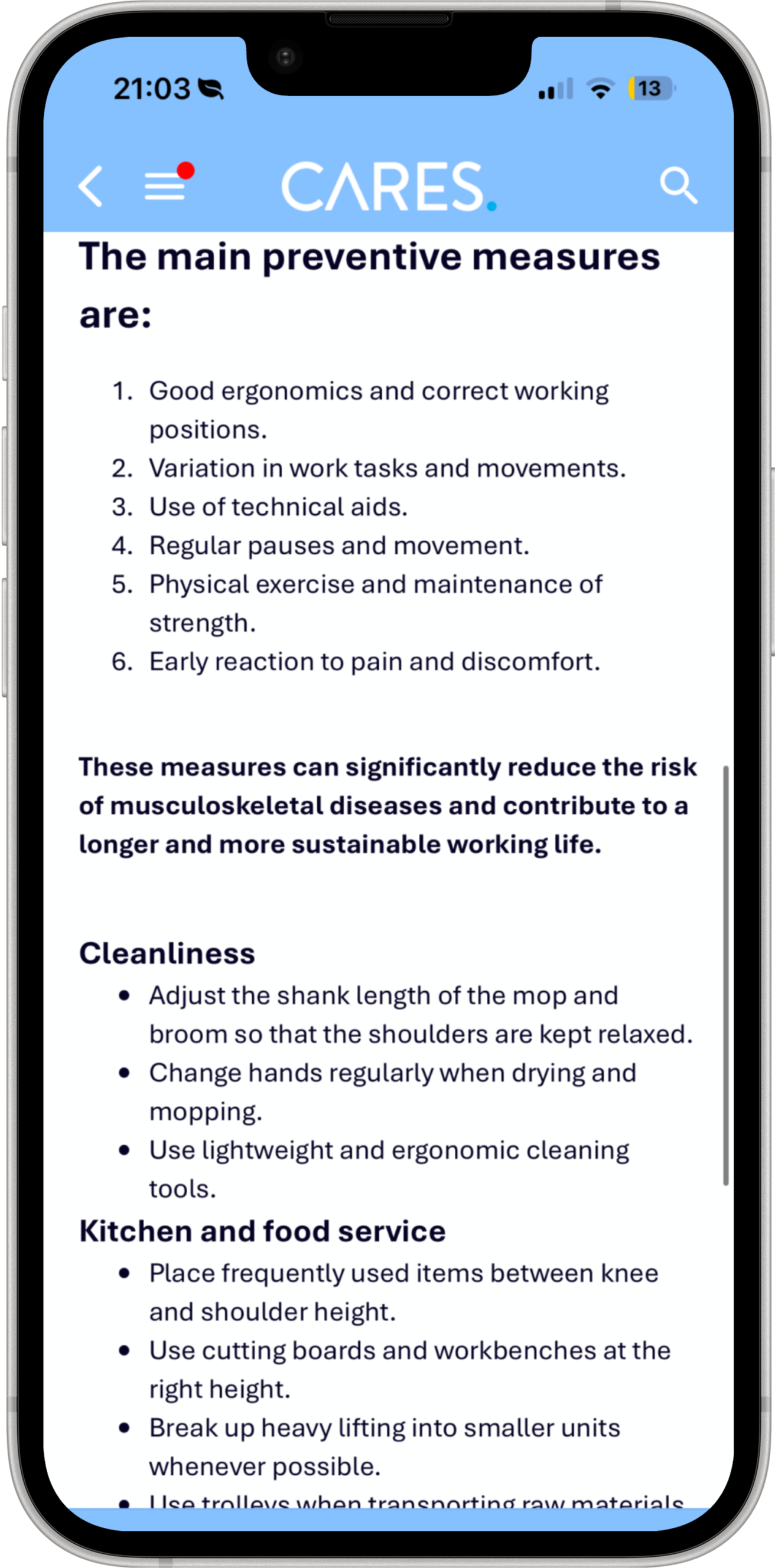


Information
overload
Large blocks of text make it difficult to quickly identify key information.
Minimal
engagement
There are few elements that encourage users to stay involved.
Passive
learning
Users are limited to reading, with little opportunity for active participation.
RESEARCH
Three things shaped the redesign
How people actually retain information, how little uninterrupted time hospitality staff have to train, and how gamification only helps when it doesn't replace the material itself.
Actively practicing information produces significantly better retention than simply reading it.
How people actually retain information, how little uninterrupted time hospitality staff have to train, and how gamification only helps when it doesn't replace the material itself.
Hospitality workers rarely have a desk or access to computers during their day, which is exactly why the experience has to be mobile first.

SCOPE
You don't need a big project to prove a point
A full training platform covers dozens of topics: onboarding, compliance, safety, service standards. Redesigning all of it wasn't necessary to prove the system works. I scoped this down to the map, the module structure, and the interaction model itself, then built one real topic, workplace ergonomics, out in full to show how the pattern holds up end to end.
I also kept the scope mobile-only, since that's how this audience actually accesses training, and used Claude Design and Figma Make to move from flows to a working prototype quickly.
FLOWS & WIREFRAMING
Thinking before designing
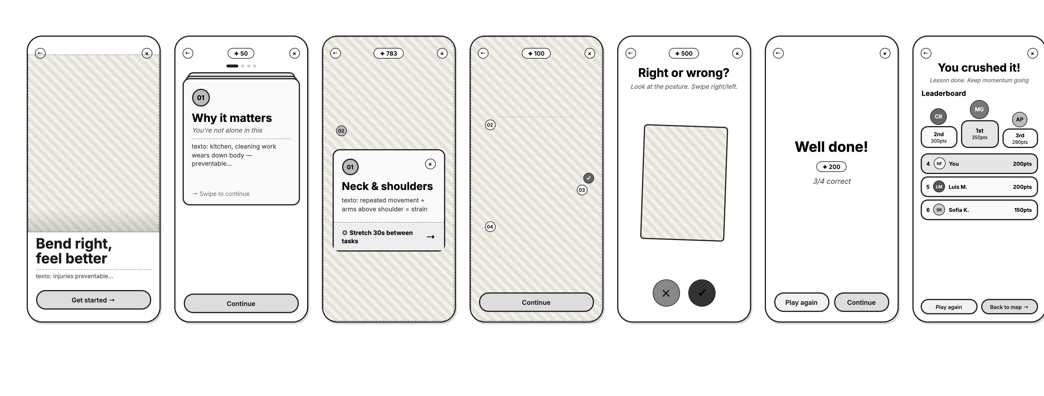
Before designing the interface, I mapped the user flow and created low-fidelity wireframes to define the structure of the experience and validate the core interactions. To accelerate this exploratory phase, I used AI to rapidly iterate on different approaches, allowing me to spend more time refining the final solution rather than producing initial drafts.


Locked module
Complete module
Available module
Games
Score results
try again
Explanation
Intro
home updated
home
DESIGN DECISIONS
Turning passive learning into an interactive experience
One of the key design decisions was encouraging users to actively interact with each screen instead of relying on long, text-heavy content. By breaking the information into smaller interactions, employees could explore the content at their own pace while maintaining engagement throughout the experience. To reinforce this behaviour, I introduced a scoring system based on gamification principles, as feedback and progress indicators can help motivate users and make learning experiences more engaging.
Swipe to discover
Users explore information through interactive cards instead of passive scrolling.
Gamified feedback
A scoring system provides feedback and encourages engagement.



FEATURE 01
From information overload to meaningful interactions
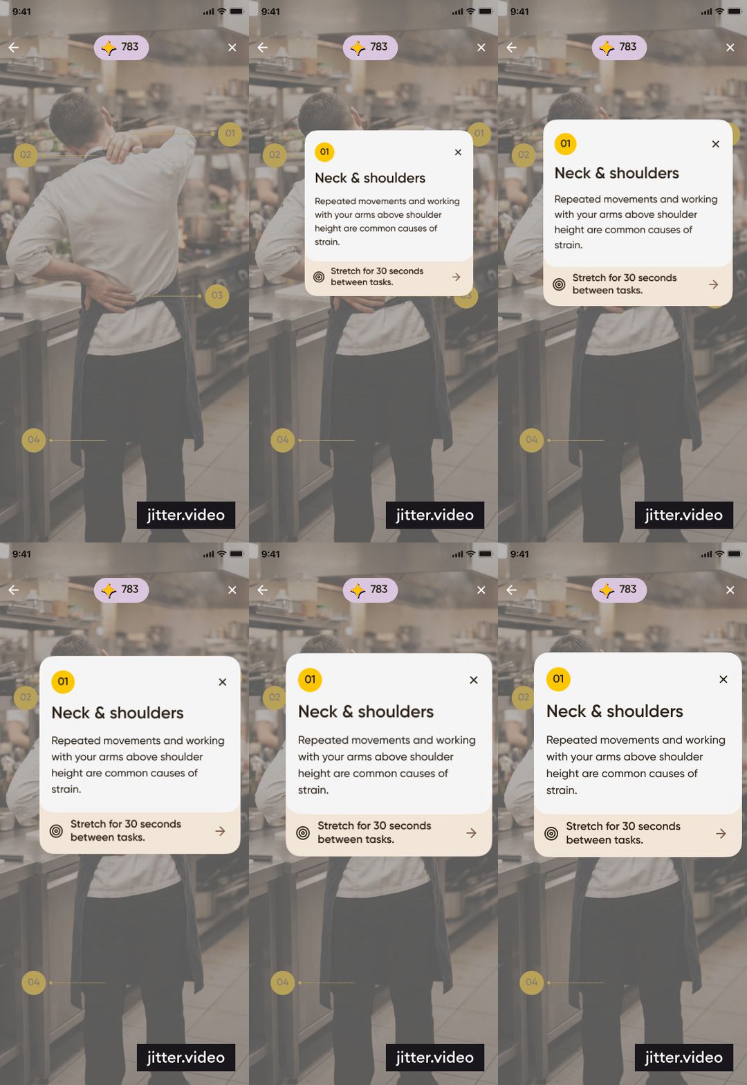
Reducing cognitive overload became the starting point for this redesign. The original platform relied heavily on long blocks of text and fragmented information, requiring employees to navigate between different sections to understand both the problem and the solution. I focused on breaking content into smaller, interactive pieces while presenting each issue alongside its corresponding solution, making the experience easier to process, understand, and remember.
Figma Make allowed me to quickly test the interaction patterns and create a more realistic representation of the final experience.
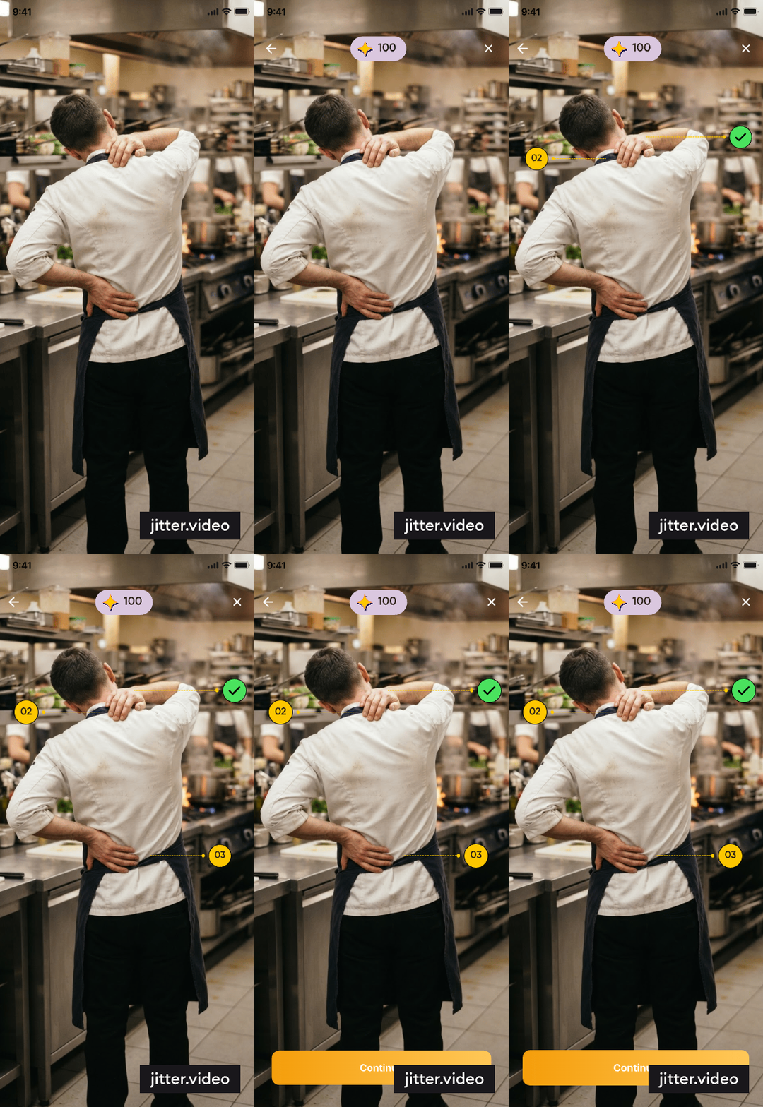

Problem + solution
The problem and its solution are presented together, helping users understand the information faster
Real-life context
A real chef helps employees identify with the training.
Interactive body map
Tap different body areas to reveal relevant information.


Built with Figma Make to test the interaction and bring the experience closer to a real product.
FEATURE 02
Using gamification to increase engagement
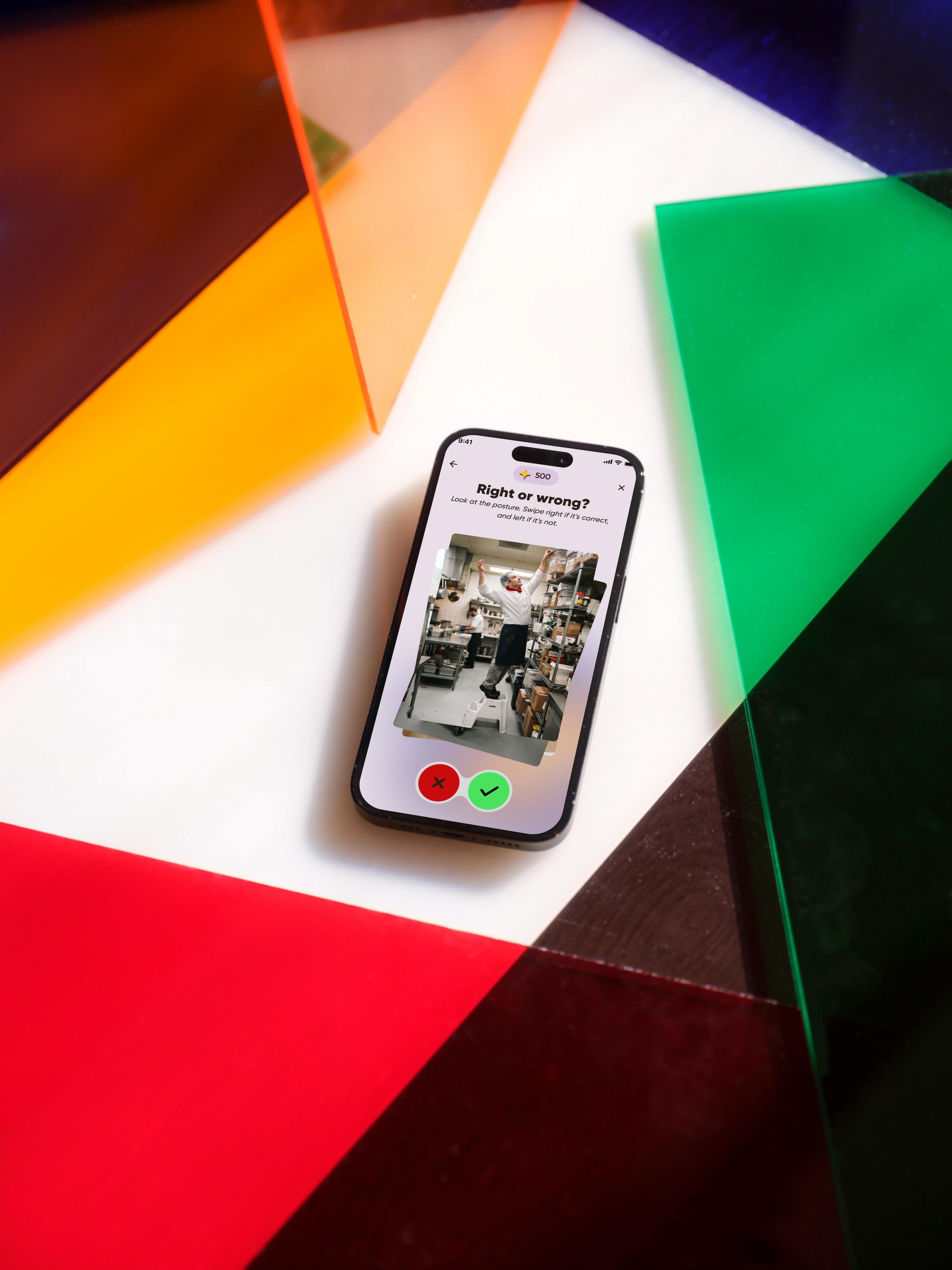
The original experience allowed users to quickly scroll through content without actively engaging with it. To encourage attention and reinforce learning, I introduced a swipe-based mini-game where employees evaluate scenarios as correct or incorrect. This transforms learning into an active experience and helps users retain information more effectively. Additionally, I introduced a ranking system to provide a sense of progress and motivation, encouraging employees to stay engaged and continue improving their performance.


Progress
& competition
A ranking system creates a sense of achievement and motivates users to keep improving.
Interactive challenge
Employees evaluate scenarios through a swipe-based mini-game, encouraging active participation.

Built with Figma Make to test the interaction and bring the experience closer to a real product.
CONCLUSION
Designing learning experiences that fit users’ reality
This project highlighted the importance of designing learning experiences around the real context and needs of users. Research showed that hospitality employees often have limited time available for training, while the original LMS required long sessions to complete each course. To address this challenge, I explored a microlearning approach, breaking complex information into shorter, focused interactions that could fit more naturally into their daily routines.
By combining microlearning principles with gamification and interactive content, the redesign transforms a passive training experience into a more engaging and accessible one. The mobile-first approach ensured that employees could access and complete training whenever needed, making learning more flexible and better adapted to their working environment.
This project also allowed me to explore how AI can enhance the design process. I used Claude with custom skills and Claude Design during the early exploration phases to accelerate ideation and refine concepts, while Figma Make helped me bring static designs to life through functional prototypes and test key interactions more effectively.
View next project

LET’S WORK TOGETHER
I’m a UX designer with a curious eye for stories and digital experiences. Looking for my first opportunity to craft designs that make life easier (and prettier). Oh, and I’m also funny and know a bunch of random fun facts. Let’s talk!
nereafcastro@gmail.com

check my CV
© 2026
Home

Work
About
Nerea Castro
home
work
about
HUDDLE
Redesigning text-heavy corporate training as a microlearning experience
Most corporate training still looks like a PDF wearing an app: long screens of policy-style text, no pacing, no interaction, built to be assigned rather than actually used. I picked one real example, a workplace ergonomics module, and rebuilt it as a gamified microlearning experience to show what training could look like if it respected how people actually read it, on a phone, standing up, between shifts.
Type:
LMS Redesign

Tools:
Figma & Claude
Industry:
Hospitality
SUMMARY
Turning personal experience into a design opportunity
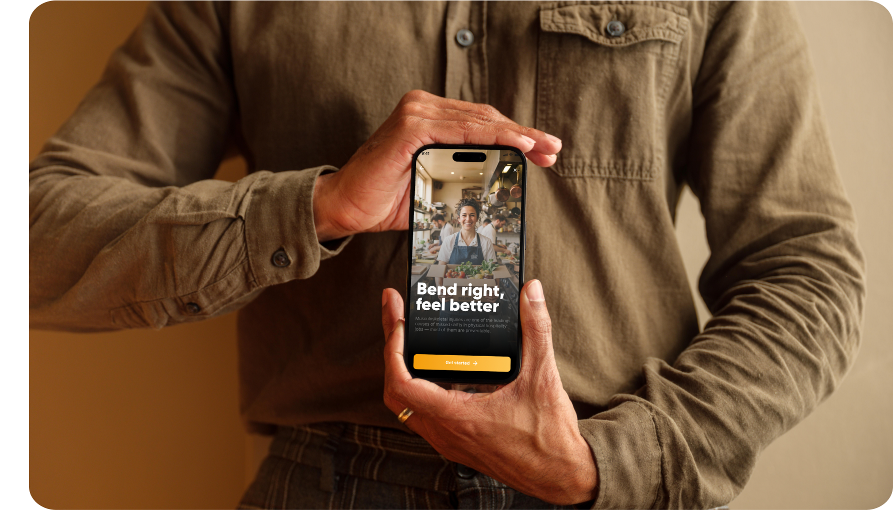
This project was inspired by my own experience as a hospitality employee using corporate training platforms. Corporate training often focuses on delivering information rather than creating effective learning experiences. I experienced first-hand how workplace ergonomics modules could become time-consuming, relying on long, static pages of text with little interaction or motivation to continue.
Research also showed that hospitality employees often have limited time available for training, which led me to explore how UX principles, microlearning, and gamification could transform the experience into a shorter, more engaging LMS solution adapted to their daily routines.
Problem: The existing LMS relied on lengthy, text-heavy modules that required significant time investment, creating cognitive overload and a passive learning experience that did not fit the reality of hospitality employees.
Solution: Redesigned the experience into a mobile-first, interactive LMS using microlearning and gamification to deliver shorter learning moments that are easier to complete, understand, and retain.


Information overload
Large blocks of text make it difficult to quickly identify key information.
Minimal engagement
There are few elements that encourage users to stay involved.
Passive learning
Users are limited to reading, with little opportunity for active participation.
RESEARCH
Three things shaped the redesign
How people actually retain information, how little uninterrupted time hospitality staff have to train, and how gamification only helps when it doesn't replace the material itself.
Actively practicing information produces significantly better retention than simply reading it.
How people actually retain information, how little uninterrupted time hospitality staff have to train, and how gamification only helps when it doesn't replace the material itself.
Hospitality workers rarely have a desk or access to computers during their day, which is exactly why the experience has to be mobile first.
SCOPE
You don't need a big project to prove a point
A full training platform covers dozens of topics: onboarding, compliance, safety, service standards. Redesigning all of it wasn't necessary to prove the system works. I scoped this down to the map, the module structure, and the interaction model itself, then built one real topic, workplace ergonomics, out in full to show how the pattern holds up end to end.
I also kept the scope mobile-only, since that's how this audience actually accesses training, and used Claude Design and Figma Make to move from flows to a working prototype quickly.
FLOWS & WIREFRAMING
Thinking before designing
Before designing the interface, I mapped the user flow and created low-fidelity wireframes to define the structure of the experience and validate the core interactions. To accelerate this exploratory phase, I used AI to rapidly iterate on different approaches, allowing me to spend more time refining the final solution rather than producing initial drafts.


Module
locked
Available module
Completed module
Games
Score results
try again
Explanation
Intro
home updated
home
DESIGN DECISIONS
Turning passive learning into an interactive experience
One of the key design decisions was encouraging users to actively interact with each screen instead of relying on long, text-heavy content. By breaking the information into smaller interactions, employees could explore the content at their own pace while maintaining engagement throughout the experience. To reinforce this behaviour, I introduced a scoring system based on gamification principles, as feedback and progress indicators can help motivate users and make learning experiences more engaging.
Swipe to discover
Users explore information through interactive cards instead of passive scrolling.
Gamified feedback
A scoring system provides feedback and encourages engagement.


FEATURE 01
From information overload to meaningful interactions
Reducing cognitive overload became the starting point for this redesign. The original platform relied heavily on long blocks of text and fragmented information, requiring employees to navigate between different sections to understand both the problem and the solution. I focused on breaking content into smaller, interactive pieces while presenting each issue alongside its corresponding solution, making the experience easier to process, understand, and remember.
Figma Make allowed me to quickly test the interaction patterns and create a more realistic representation of the final experience.

Problem + solution
The problem and its solution are presented together, helping users understand the information faster
Real-life context
A real chef helps employees identify with the training.
Interactive body map
Tap different body areas to reveal relevant information.


Built with Figma Make to test the interaction and bring the experience closer to a real product.
FEATURE 02
Using gamification to increase engagement
The original experience allowed users to quickly scroll through content without actively engaging with it. To encourage attention and reinforce learning, I introduced a swipe-based mini-game where employees evaluate scenarios as correct or incorrect. This transforms learning into an active experience and helps users retain information more effectively. Additionally, I introduced a ranking system to provide a sense of progress and motivation, encouraging employees to stay engaged and continue improving their performance.
Progress & competition
A ranking system creates a sense of achievement and motivates users to keep improving.
Interactive challenge
Employees evaluate scenarios through a swipe-based mini-game, encouraging active participation.
Built with Figma Make to test the interaction and bring the experience closer to a real product.
CONCLUSION
Designing learning experiences that fit users’ reality
This project highlighted the importance of designing learning experiences around the real context and needs of users. Research showed that hospitality employees often have limited time available for training, while the original LMS required long sessions to complete each course. To address this challenge, I explored a microlearning approach, breaking complex information into shorter, focused interactions that could fit more naturally into their daily routines.
By combining microlearning principles with gamification and interactive content, the redesign transforms a passive training experience into a more engaging and accessible one. The mobile-first approach ensured that employees could access and complete training whenever needed, making learning more flexible and better adapted to their working environment.
This project also allowed me to explore how AI can enhance the design process. I used Claude with custom skills and Claude Design during the early exploration phases to accelerate ideation and refine concepts, while Figma Make helped me bring static designs to life through functional prototypes and test key interactions more effectively.
View next project
nereafcastro@gmail.com

check my CV
I’m a UX designer with a curious eye for stories and digital experiences. Looking for my first opportunity to craft designs that make life easier (and prettier). Oh, and I’m also funny and know a bunch of random fun facts. Let’s talk!
home
work
about
HUDDLE
Redesigning text-heavy corporate training as a microlearning experience
Most corporate training still looks like a PDF wearing an app: long screens of policy-style text, no pacing, no interaction, built to be assigned rather than actually used. I picked one real example, a workplace ergonomics module, and rebuilt it as a gamified microlearning experience to show what training could look like if it respected how people actually read it, on a phone, standing up, between shifts.
Type:
LMS Redesign

Tools:
Figma & Claude
Industry:
Hospitality
SUMMARY
Turning personal experience into a design opportunity
This project was inspired by my own experience as a hospitality employee using corporate training platforms. Corporate training often focuses on delivering information rather than creating effective learning experiences. I experienced first-hand how workplace ergonomics modules could become time-consuming, relying on long, static pages of text with little interaction or motivation to continue.
Research also showed that hospitality employees often have limited time available for training, which led me to explore how UX principles, microlearning, and gamification could transform the experience into a shorter, more engaging LMS solution adapted to their daily routines.
Problem: The existing LMS relied on lengthy, text-heavy modules that required significant time investment, creating cognitive overload and a passive learning experience that did not fit the reality of hospitality employees.
Solution: Redesigned the experience into a mobile-first, interactive LMS using microlearning and gamification to deliver shorter learning moments that are easier to complete, understand, and retain.


Information overload
Large blocks of text make it difficult to quickly identify key information.
Minimal engagement
There are few elements that encourage users to stay involved.
Passive learning
Users are limited to reading, with little opportunity for active participation.
RESEARCH
Three things shaped the redesign
How people actually retain information, how little uninterrupted time hospitality staff have to train, and how gamification only helps when it doesn't replace the material itself.
Actively practicing information produces significantly better retention than simply reading it.
How people actually retain information, how little uninterrupted time hospitality staff have to train, and how gamification only helps when it doesn't replace the material itself.
Hospitality workers rarely have a desk or access to computers during their day, which is exactly why the experience has to be mobile first.
SCOPE
You don't need a big project to prove a point
A full training platform covers dozens of topics: onboarding, compliance, safety, service standards. Redesigning all of it wasn't necessary to prove the system works. I scoped this down to the map, the module structure, and the interaction model itself, then built one real topic, workplace ergonomics, out in full to show how the pattern holds up end to end.
I also kept the scope mobile-only, since that's how this audience actually accesses training, and used Claude Design and Figma Make to move from flows to a working prototype quickly.
FLOWS & WIREFRAMING
Thinking before designing
Before designing the interface, I mapped the user flow and created low-fidelity wireframes to define the structure of the experience and validate the core interactions. To accelerate this exploratory phase, I used AI to rapidly iterate on different approaches, allowing me to spend more time refining the final solution rather than producing initial drafts.


Module
locked
Available module
Completed module
Games
Score results
try again
Explanation
Intro
home updated
home
DESIGN DECISIONS
Turning passive learning into an interactive experience
One of the key design decisions was encouraging users to actively interact with each screen instead of relying on long, text-heavy content. By breaking the information into smaller interactions, employees could explore the content at their own pace while maintaining engagement throughout the experience. To reinforce this behaviour, I introduced a scoring system based on gamification principles, as feedback and progress indicators can help motivate users and make learning experiences more engaging.
Swipe to discover
Users explore information through interactive cards instead of passive scrolling.
Gamified feedback
A scoring system provides feedback and encourages engagement.


FEATURE 01
From information overload to meaningful interactions
Reducing cognitive overload became the starting point for this redesign. The original platform relied heavily on long blocks of text and fragmented information, requiring employees to navigate between different sections to understand both the problem and the solution. I focused on breaking content into smaller, interactive pieces while presenting each issue alongside its corresponding solution, making the experience easier to process, understand, and remember.
Figma Make allowed me to quickly test the interaction patterns and create a more realistic representation of the final experience.

Problem + solution
The problem and its solution are presented together, helping users understand the information faster
Real-life context
A real chef helps employees identify with the training.
Interactive body map
Tap different body areas to reveal relevant information.

Built with Figma Make to test the interaction and bring the experience closer to a real product.
FEATURE 02
Using gamification to increase engagement
The original experience allowed users to quickly scroll through content without actively engaging with it. To encourage attention and reinforce learning, I introduced a swipe-based mini-game where employees evaluate scenarios as correct or incorrect. This transforms learning into an active experience and helps users retain information more effectively. Additionally, I introduced a ranking system to provide a sense of progress and motivation, encouraging employees to stay engaged and continue improving their performance.
Progress & competition
A ranking system creates a sense of achievement and motivates users to keep improving.
Interactive challenge
Employees evaluate scenarios through a swipe-based mini-game, encouraging active participation.
Built with Figma Make to test the interaction and bring the experience closer to a real product.
CONCLUSION
Designing learning experiences that fit users’ reality
This project highlighted the importance of designing learning experiences around the real context and needs of users. Research showed that hospitality employees often have limited time available for training, while the original LMS required long sessions to complete each course. To address this challenge, I explored a microlearning approach, breaking complex information into shorter, focused interactions that could fit more naturally into their daily routines.
By combining microlearning principles with gamification and interactive content, the redesign transforms a passive training experience into a more engaging and accessible one. The mobile-first approach ensured that employees could access and complete training whenever needed, making learning more flexible and better adapted to their working environment.
This project also allowed me to explore how AI can enhance the design process. I used Claude with custom skills and Claude Design during the early exploration phases to accelerate ideation and refine concepts, while Figma Make helped me bring static designs to life through functional prototypes and test key interactions more effectively.
View next project
nereafcastro@gmail.com
check my CV
I’m a UX designer with a curious eye for stories and digital experiences. Looking for my first opportunity to craft designs that make life easier (and prettier). Oh, and I’m also funny and know a bunch of random fun facts. Let’s talk!